Hero redesign
Velociti
Live site
velocitipm.comBefore and after
What used to happen
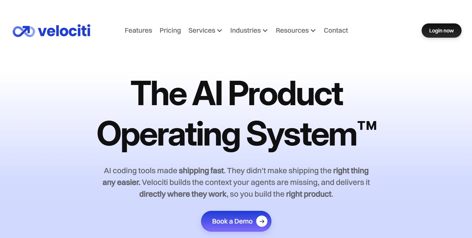
Honestly, I only understood Velociti after I used the product. From the site alone I could not tell what it actually did. The opening sections explained the idea, but the product visual never showed how it works or what you get, and that is a reason to bounce. The UI also looked fairly standard next to how differentiated the product is, which made it feel less valuable than it is.
Before
After
So the hero now shows the actual flow as a looped product demo: an idea goes in, and Velo AI turns it into a canvas, a problem map, a story map and a sequenced strategy. The headline, "Your agents can build anything. They still don't know why.", leads with the tension the whole product solves, and the visual shows how it solves it. I simplified the real UI for the marketing context, so it is not too much for someone seeing it for the first time.

Let's build something worth shipping
Pick a time below. No back-and-forth required.