Decision 01
Type right there
What used to happen
You landed on the homepage, clicked, and a modal opened just to ask what you wanted. Two screens before you could type a word, each click is a friction point, drop off rate was higher.
Before
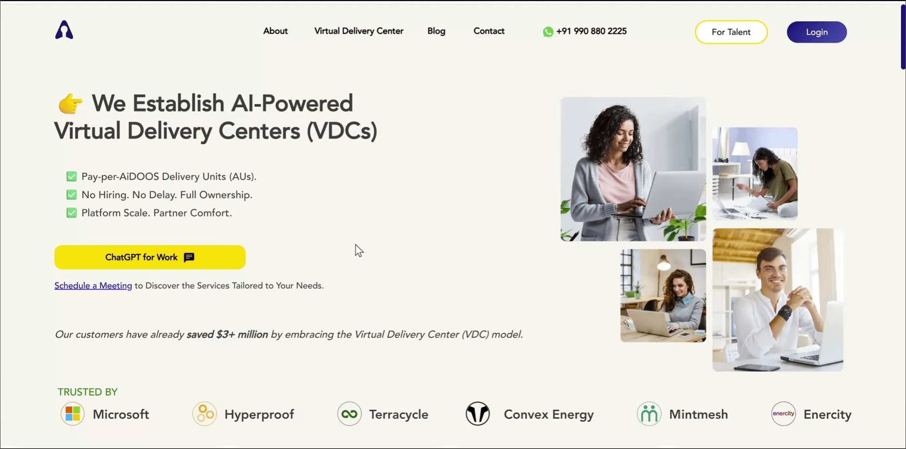
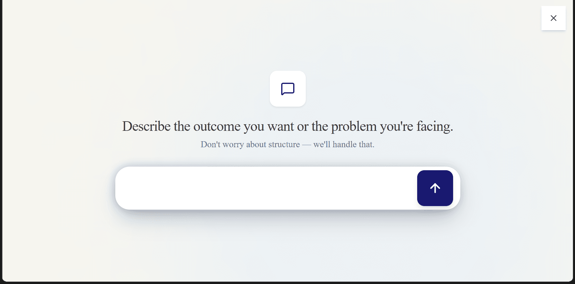
After
The chat input sits in the hero. You land, you type right there.
Decision 02
Show them you're actually reading it
The next screen is a short one that narrates what the system is doing with what they wrote: reading the brief, pulling out modules, estimating time. Not a spinner. The first proof their words went somewhere, because they might be skeptical if it is just a template or an actual engine
Decision 03: the single most important screen
Understanding, not a form
The next screen is where that trust is won or lost. Earlier, it used to generate the proposal with just the typed input.. a 100 char input is not enough to build a business plan, we needed more context.. This screen gets that context after making sure it provides value before asking, zoom in and out to read the thought behind each section...
Decision 04
A page, not a modal
The next screen is finally the proposal... It used to come as a modal but modal is for a decision you make and dismiss. A proposal is a document you read. So I moved it to its own page, with its own URL, and gave the sections a real order. The page is capped at a fixed width too, easier for the eye to read just like medium articles
After the proposal is accepted
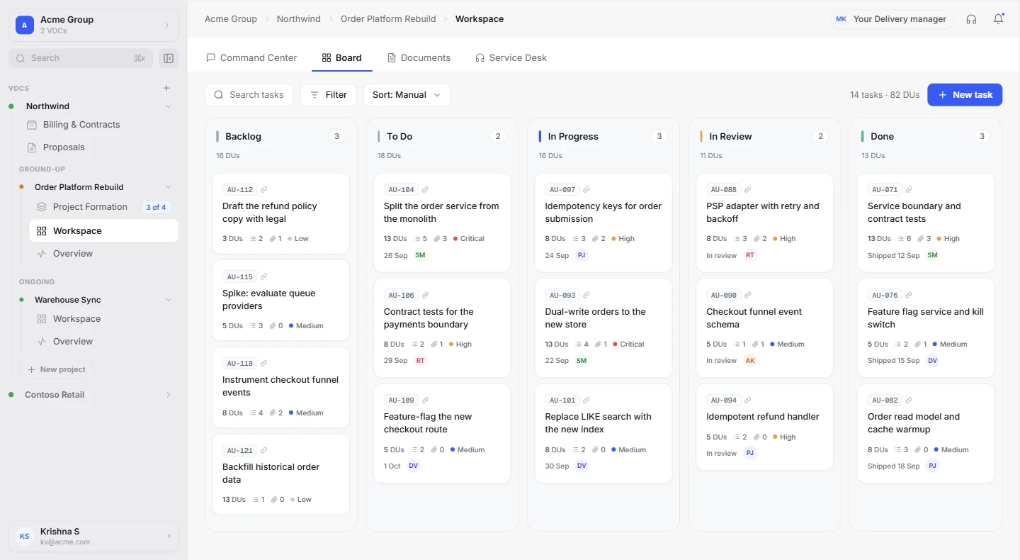
Once a client says yes, the team is matched, the SOW is signed, the wallet is funded, and the project goes live in its workspace.
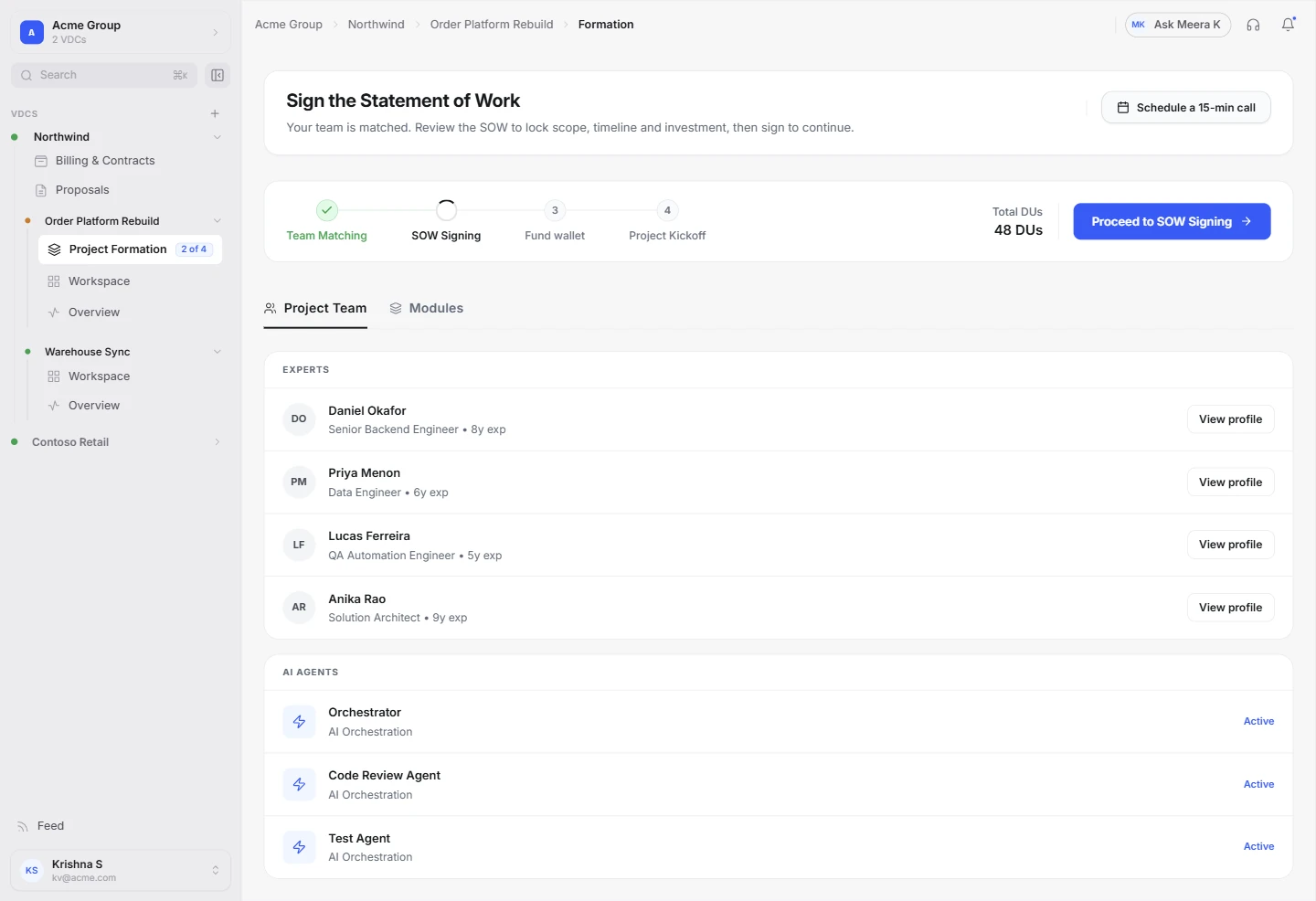
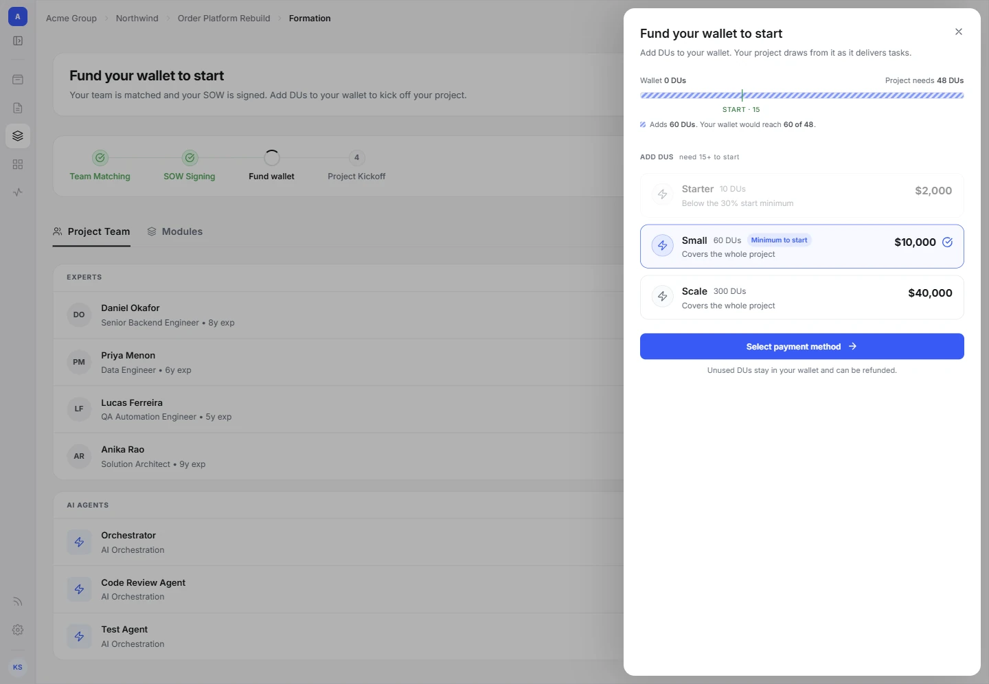
21 screens in the full flow, desktop and mobile.
See them all in Paper